So centering your blog might not be something you've ever thought about. To you, your blog IS centered. But, did you know that to others with different screen resolutions, your blog could be quite difficult to see?
There is this lovely website called View Like Us that can show you your blog in any resolution. So when I thought my blog looked like this...
it actually looked like this...
Womp womp! All those poor people with screen resolutions smaller than mine were having to scroll all over the place just to see my posts! Doesn't really encourage them to come back, does it?
So how do we fix this? Well, it's actually just a few little quick fixes.
First, before you ever make any changes to your HTML or CSS it is a good idea to backup your template. Trust me, you will be shooting yourself if you make a mistake and didn't backup. On your Blogger dashboard click 'Template' and then Backup/Restore
Then click 'Download full template'
Now we can confidently move on, knowing you can't do anything that can't be undone with a simple 'Restore'. Now, to fix our width. While you're still in 'Template', click customize
In the customize menu, click 'Adjust widths'. Play around with the size to get it in the center. I like to 'apply' to blog' and then go back to View Like Us to check it and make sure it looks ok for each resolution.
Now you have the blog itself centered, how do you center the individual items on your blog? This is where the CSS code comes in. This is really handy because you can change the position of each element of your blog separately to get it where you like it. Maybe you'd like your post title in different position or maybe you used a custom image as a header with an HTML gadget (tutorial for that here) instead of Blogger's preset header function. This makes customizing your blog really easy.
To do this, go to your Blogger dashboard and click the 'Layout' tab.
Click the specific element you are wanting to change the alignment on.
Enter this at the beginning of your code:
I've entered 'MyBanner' because that is what I'm centering. Essentially you are adding an ID to your HTML gadget so when you enter your CSS code, it knows what gadget to alter. For instance, if you are wanting to move your profile picture, you could enter 'profilepicture'. You could name it 'rainbowsandsunshine' if you really wanted. It doesn't matter, you're just giving this element a unique identifier.
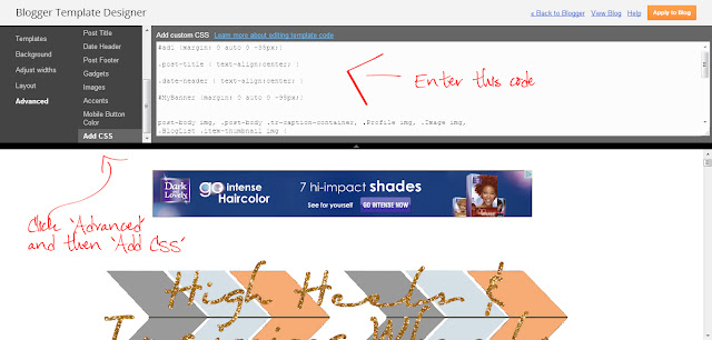
Then you are going back to your 'Template' and then back to 'Customize' and this time click 'Advanced'. Scroll down until you see 'Add CSS'.
Now you want to add your CSS code telling it where you want your specific gadget you just named.
Again, I am using 'MyBanner' because that's what I'm focusing on. You will enter whatever name you gave your gadget in the last step. Be sure to include the # before your gadget's name. Where you see '-95', this is the number that changes it's position. Change this number and play around with it until it's positioned where you want your gadget. You will be able to see what your blog will look like in the window below the code. Now, go back to
View Like Us to make sure everyone else is seeing what you're seeing. That's it, you're done! Boom!
As always, if you have any questions be sure to ask. I'm here to help! Happy blogging!
 You can also find High Heels on Bloglovin', Twitter, Facebook and Pinterest!
linking up with: Hooking Up With HOH / Your Creative Timeout / Show & Tell / Mingle With Us / Great Idea Thursday / Whimsy Wednesday / Wednesday Whatsits / Showcase Your Talent / Transformation Thursday / Catch a Glimpse / Made You Look / Blog Stalking / Keep Calm & Linkup / Sunday Funday


Love your Blog tips. I was a little worried as I was reading your post and quickly went over to check my site, happy to report it's perfectly fine. Love your new look BTW. The colors and glitter are so pretty.
ReplyDeleteThanks for the great information! I'm a new flower found you through A Glimpse Inside link party :-)
ReplyDeletehttp://christyscraftycorner.blogspot.com/2013/04/birds-and-butterflies-and-boxers-oh-my.html
I didn't realize this was an issue, but now that you mention it, it makes sense that each page wouldn't look the same in every resolution. Thanks for pointing this out. :-)
ReplyDeleteJust pinned!! I need all the techy help I can get:))) Dropping in from Lets Get Social Sunday to thank you for joining in and am now also following via Pinterest!
ReplyDeleteHugs
Pinning this! We need to do this so thank you for this tutorial!! Found you on the Monday Mingle blog hop. Now following on bloglovin'. Would love return follows :) Looking forward to seeing more of your posts! www.sugaraunts.com
ReplyDeleteThanks for sharing this!
ReplyDeleteHi! Stopping by from Mom Bloggers Club. Great blog!
Have a nice day!
Thanks for sharing!!
ReplyDeleteHi! Stopping by from Mom Bloggers Club. Great blog!
Have a nice day!
Thanks so much for sharing this @ Great Idea Thursday's. I'm still learning the ins and outs of HTML and CSS. So much to learn! Krista @ http://ahandfulofeverything.blogspot.com
ReplyDeleteThanks for linking up to Gingerly Made's Show & Tell party. You've been featured! http://www.gingerlymade.com/2013/04/show-tell-features_30.html
ReplyDeleteFeaturing your great blog tip today on Made in a Day! Thanks for linking it up!
ReplyDeleteKim